Project Overview
Background
Our team was tasked with creating a solution for a problem of our choice. We brainstormed several ideas together until we noticed a steady theme of wanting a way to practice self-care.
Problem
We’ve observed that people are generally motivated to help others but overlook their own needs. Therefore, our users need a motivator or incentive to help themselves.
Solution
Creating a buddy-system application with positive reinforcements and minimal time commitments will help make self-care habitual in our users’ daily lives.
Value
Practicing habitual self-care will improve our users’ overall lifestyle and health.
My Role
UX Researcher and UI Designer. I contributed to our research by interviewing users and creating the survey. I led our team in wireframing, UI style tile, user testing, and prototype iteration based on our research.
Timeline
19 February 2021 - 10 March 2021
(2.5 weeks)
Team Members
Jennifer Quach, Jodi G., and Megan W.
Tools
Figma, Miro, Adobe Illustrator
Our Process & Methods
Proto-Persona
Empathy Map
User Survey
User Interviews
Affinity Diagram
User Persona
Problem Statement
User Insight Statement
Value Proposition
Storyboard
Competitor Analysis
Feature Brainstorming
Feature Priority Matrix
User Flow
Lo-Fi Wireframes
Mid-Fi Wireframes
Mid-Fi Prototype
Guerilla User Tests
Prototype Iteration
Front-End Coding
UI Style Tile
Hi-Fi Prototype
1. Research
Our research objective was to find out how we can best support individuals in creating daily self-care habits. To achieve our goal, we began by making assumptions about our users by completing a proto-persona. We then completed 6 user interviews and published a 15-question survey to which we received over 150 responses. Then, we organized our data into an affinity diagram to create our empathy map and finalize the details for our user persona.
Proto-Persona
Before interviewing users or sending out surveys, our team created a proto-persona based on our assumptions to identify our potential target audience.
User Survey & Interviews
After creating our proto-persona, our team interviewed 6 users to find out how we can best support individuals in creating daily self-care habits. Additionally, we sent out a 15-question survey, which received over 150 responses, to find out what our users know about self-care. We organized over 300 user insights into an affinity diagram and found the following:
Out of 164 surveyors, only 25 have enough time to practice self-care
Our users prefer a positive, non-judgemental, thoughtful, and engaging voice or coach
Our users have many barriers to self-care and the COVID-19 pandemic adds more strain to it
Empathy Map
Our team created an empathy map for our proto-persona to reflect the information we’ve gathered from our user survey and interviews. By doing so, we were able to get into the mindset of our users and understand their pain points.
User Persona
To end the research phase, we took our proto-persona and polished it based on a combination of our user insights. Going forward in the project, we referred to this persona to ensure our application was on track with our ideal users and their wants/needs.
2. Definition
We began the definition phase by interpreting our research data into a problem statement, user insight statement, and value proposition statement. Then we crafted a storyboard for our user persona to show why someone would use our application.
We believe that people are generally motivated to do good for others, but overlook themselves, as such we want to create a buddy-system application with positive reinforcements and minimal time commitments that will help those who struggle to properly take care of their basic needs learn to make self-care habitual in their daily lives
Daniel, an overworked and underappreciated 25-year-old needs motivation to establish habitual self care, because it will increase his physical and mental well-being
Our team is creating an app to help young adults create self-care habits. We are better than the other apps by gamifying our experience, by focusing on a holistic approach to your wellness, and by breaking through the bubble baths and face masks self-care trope. We know how easy it is to do good for others while overlooking ourselves. We are using this insight as our central theme giving users a little friend that they will care for as they care for themselves
Storyboard
Our user story details why Daniel would want to try our self-care application and how it has affected him.
3. Ideation
With our application defined, we began our ideation phase by conducting a competitor analysis for four direct and three indirect competitors. Then, our team brainstormed features through the “I Like, I Wish, What If” activity. We did dot voting to choose features and organized them in a feature prioritization matrix. Finally, we created a user flow to show the pathway our users could take.
Competitor Analysis
Direct: Headspace, Happify, Fabulous, and Youper
Indirect: Therapy, Insight Timer, and YouTube
We looked into four direct competitors and three indirect competitors to find their strengths and weaknesses. By doing this, it gave our team some good ideas and inspiration on how to move forward with our application.
Our competitors have disruptive ads that took away from the user experience
Our competitors are educational and have interactive elements
Our competitors are not affordable, have too much text, and too many notifications
Feature Brainstorming & Feature Priority Matrix
After evaluating our competitors, our team brainstormed realistic to currently unreachable ideas using the “I Like, I Wish, What If” method. Then, we conducted dot voting to see which ideas we thought were valuable to our users and organized them into a feature prioritization matrix. With this, our team decided to prioritize the following:
We want our application to be simple and not overwhelmingly educational
We need to give our users motivation to help themselves
We want to make our application fun and allow our users to have breaks
EUREKA!
As our team was working on the user flow, in the next section, we found ourselves struggling with where to start. We sat about 10 minutes in silence thinking about how our user flow should look before I suggested sketching out our ideas. With that, we all went to work on Miro drawing out how we interpreted our ideas. This clarified any miscommunication and is where “gamifying” our application came to life. We drew these sketches with games such as Tamagotchi, Animal Crossing, and Stardew Valley in mind.
User Flow
After our eureka moment, we were able to solidify our user flow. This shows pathways users can take for viewing their settings, statistics, goals, activities, and the marketplace.
4. Prototyping
We took our strongest ideas and created low-fidelity wireframes. After discussing our designs, we combined our ideas to create the mid-fidelity wireframes. We delegated each section of the application evenly and would often ask for feedback from each other. Once our wireframes were complete, we connected our frames together to create our mid-fidelity prototype.
Lo-Fi Wireframes
We took our sketches and ideas and created lo-fi wireframes. Below you can see our ideas for the loading screen, account creation, buddy customization, daily tip mechanism, goal setting, activities, settings, statistics, and celebration.
Mid-Fi Wireframes & Prototype
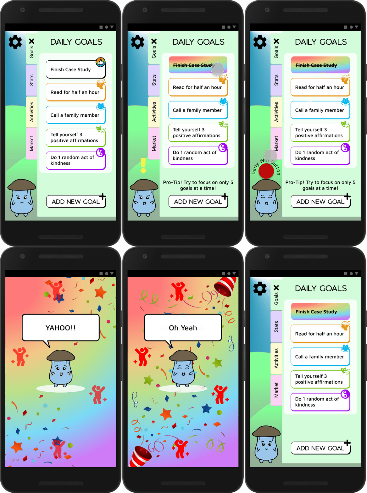
With a more solid idea in mind, we converted our lo-fi wireframes into mid-fi wireframes. This is where our team introduced a bit of ’90s nostalgia into the application branding.
5. Testing & Iteration
Our user testing began with creating a plan that outlined our objectives, questions for our users, and tasks they needed to complete. Our team conducted a total of 6 guerrilla user tests. Then, we discussed our findings and created a list of potential iterations which allowed us to finalize our UI style tile. We also decided to code a one-page landing website so anyone who would be searching for self-care tools would be able to find us via the app store and the internet.
Guerilla User Tests & Prototype Iteration
Our guerilla user tests were based on our mid-fi prototype. Before we tested our users, we made an important note to ask how our users were feeling before they tested our prototype in order to see if there were any changes in their mood. From our tests we found several iterations that needed to be made and observed these key findings:
All of our users felt happier using the application
We needed to fix branding inconsistencies
We needed more customization in setting goals
Front-End Code
While our team iterated on the prototype, we decided to code a web landing page using HTML 5, CSS 3, and Bootstrap. The purpose of the landing page is to inform users about the application, showcase future content, and answer frequently asked questions.
UI Style Tile
Our team was able to finalize our UI style guide after iterating our prototype.
Conclusion
Our team of three saw an opportunity to help those who are struggling with daily self-care by creating a buddy-system application with positive reinforcements and minimal time commitments. Our current user tests ultimately showed us that Just for Today achieved our goal of making people happier. However, we won’t be able to test if habitual self-care is successful with this application unless it is developed.
At the end of this project, we’ve learned the following as a group:
Our individual strengths complemented one another.
Working as a team adds more depth to a project especially when everyone genuinely enjoys what they’re doing.
Having a different idea does not mean it is a bad idea.
Future Plans and Goals
Conduct user tests on our high fidelity prototype
Create a more personalized logo for the brand
Add example products to the market tab
Hi-Fi Prototype for Android


